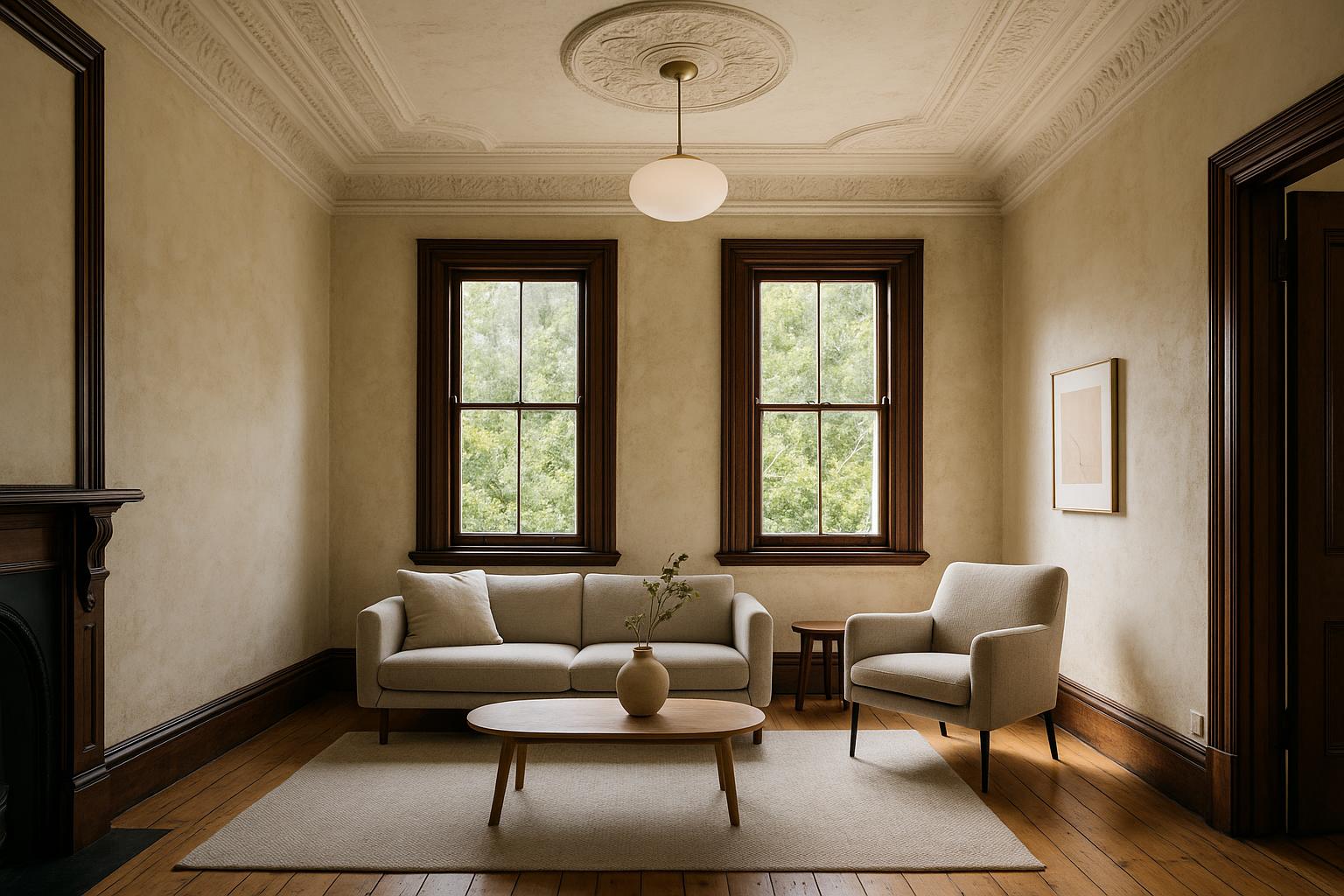
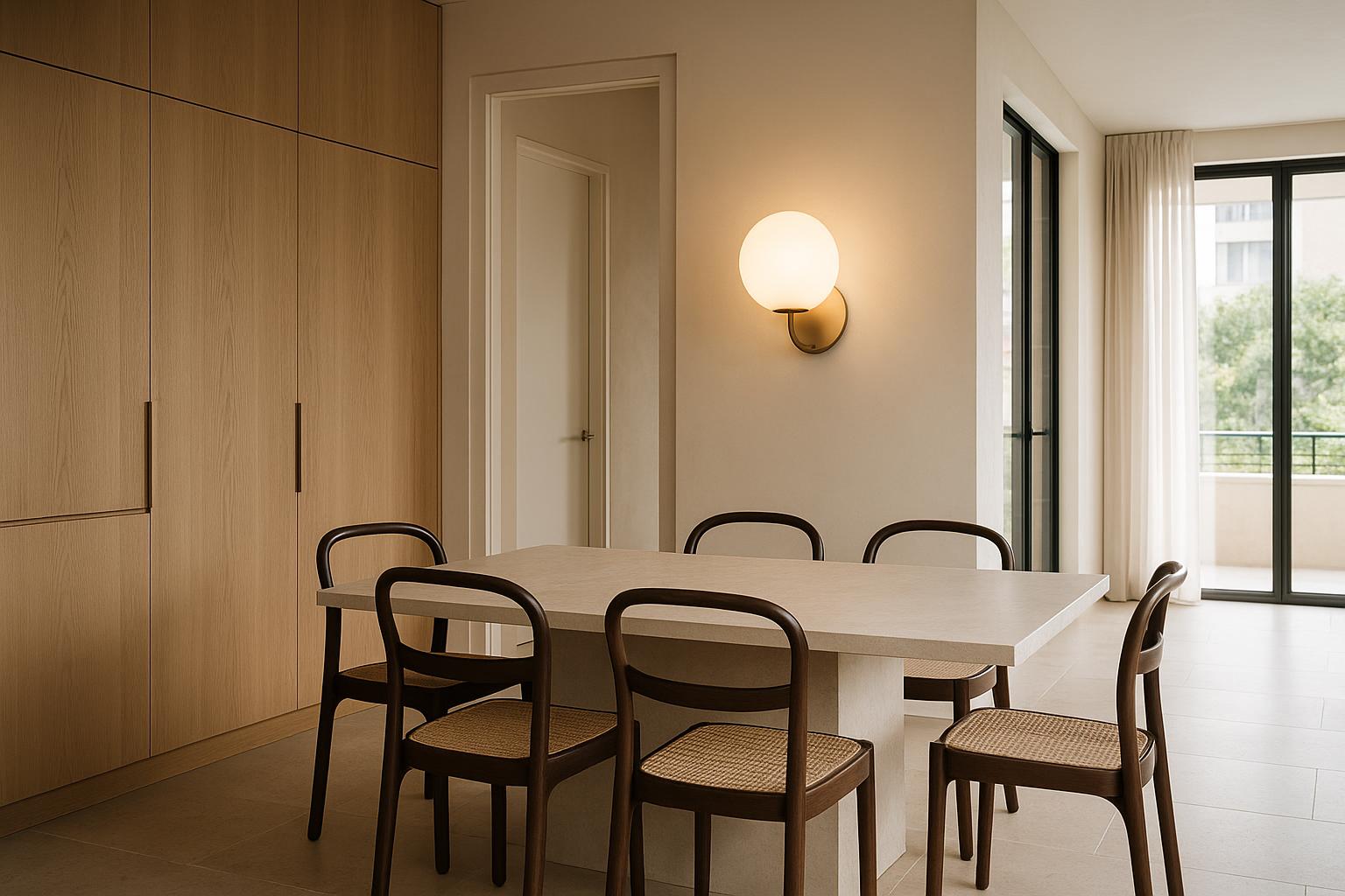
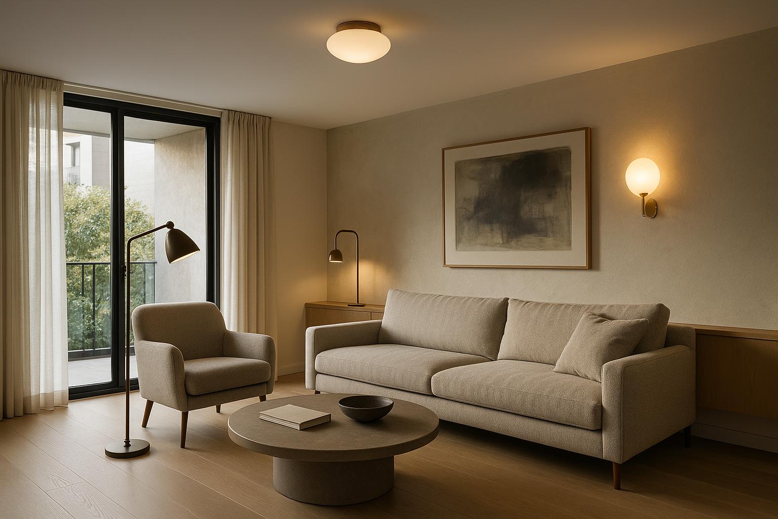
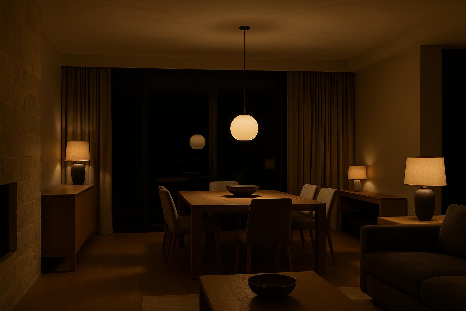
The most useful lighting retailer is not necessarily the one with the largest catalogue. Use a real project brief to...
- There are no more items in your cart
- Shipping
- Total $0.00
How to Recognise a Light Fitting Worth Living With
An expensive light fitting can still be poorly suited to its room. It may have an impressive finish but awkward proportions, or photograph beautifully while producing uncomfortable glare. A more useful measure of premium quality is how completely the design has been resolved, from the ceiling plate to the light falling on the surface below.
This takes more than a quick reaction to colour or style. Construction, scale, illumination and maintenance all contribute to the experience of a fitting. Some details are visible immediately; others only become apparent when the light is dimmed, adjusted, cleaned or viewed from a chair rather than from the doorway.
Begin with construction rather than decoration
Finish attracts attention first, but construction usually reveals more. Follow the fitting from its point of attachment through every change in material or direction. A ceiling pendant includes the canopy, cord or rod, connectors, body and underside. A wall light includes the mounting plate as well as the decorative face. These elements should appear related rather than assembled from unrelated parts.

Look at how glass meets metal, how an arm enters its wall plate and whether visible screws or collars suit the rest of the design. Exposed hardware is not inherently crude. On a technical or industrial fitting, it can provide character. The issue is whether each junction appears intentional and appropriately scaled.
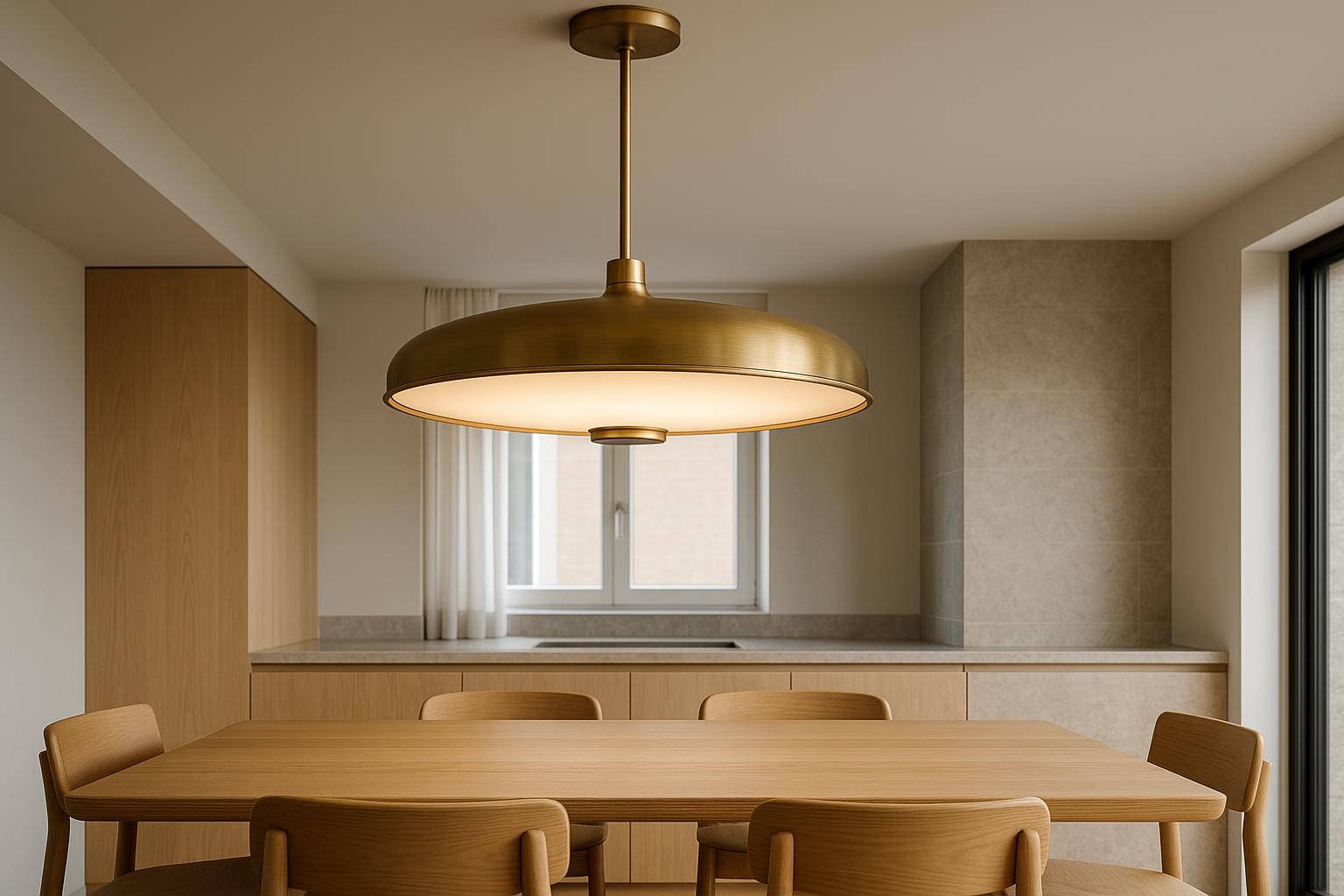
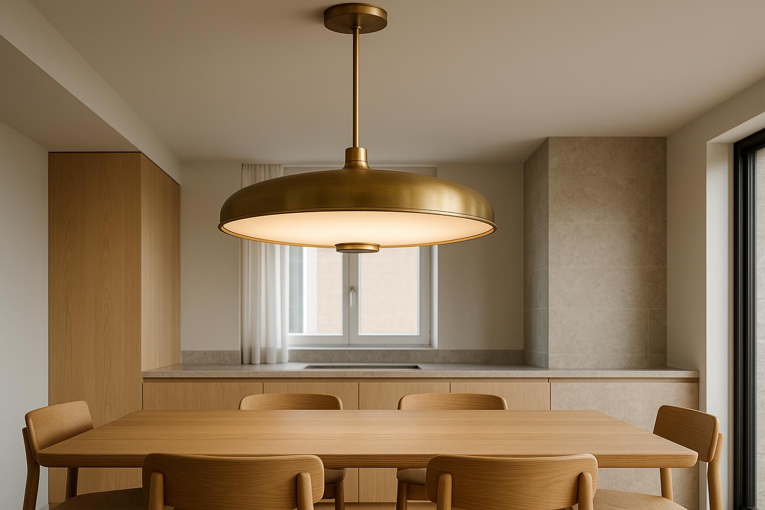
Edges also deserve attention. Rolled rims, shade openings and the borders of backplates are often visible at close range. On pendants, inspect the underside rather than relying on a front-facing product image. It is frequently the surface seen by people seated at a dining table or kitchen island.
Check proportion against fixed references
Dimensions on a product page are accurate but abstract. A 500 mm pendant can feel substantial in a showroom display and unexpectedly small over a three-metre island. Relate its measurements to fixed elements in the room: the table width, joinery modules, doorway height and distance to adjacent walls.
A paper outline or lightweight cardboard template can make the diameter easier to judge before installation. For a suspended fitting, include its vertical drop and ceiling canopy in the mock-up. This reveals whether the body will sit comfortably within the room or interrupt a view through an open-plan area.
Proportion also applies within the object. A large shade on a slight stem may look deliberately delicate, but the relationship must still feel stable. Similarly, a substantial fitting paired with a token ceiling plate can seem unresolved even when both components are individually attractive.
Consider how the finish behaves
A finish is not simply a colour selection. It responds to daylight, nearby materials and handling. Polished metal produces distinct reflections, brushed surfaces soften them, and textured coatings create small shadows of their own. Product photographs taken under diffuse studio lighting may not show how assertive these effects become beside a bright window.
To complement this topic, you can also read The Night-Time Path: Lighting the Spaces Between Rooms.
Australian interiors can receive intense directional daylight, particularly in rooms with broad north- or west-facing glazing. A warm metal that looks muted online may become a strong visual accent in afternoon sun. Dark finishes can provide useful definition against pale walls but may feel repetitive when used across every pendant, sconce and track in a compact home.
Exact coordination with taps, handles and furniture is rarely essential. A room often feels more considered when finishes share a degree of warmth or restraint without attempting to match perfectly. What matters within the fitting itself is that any variation looks deliberate rather than accidental.
Trace the path of the light
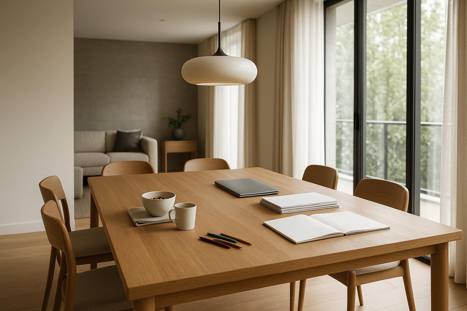
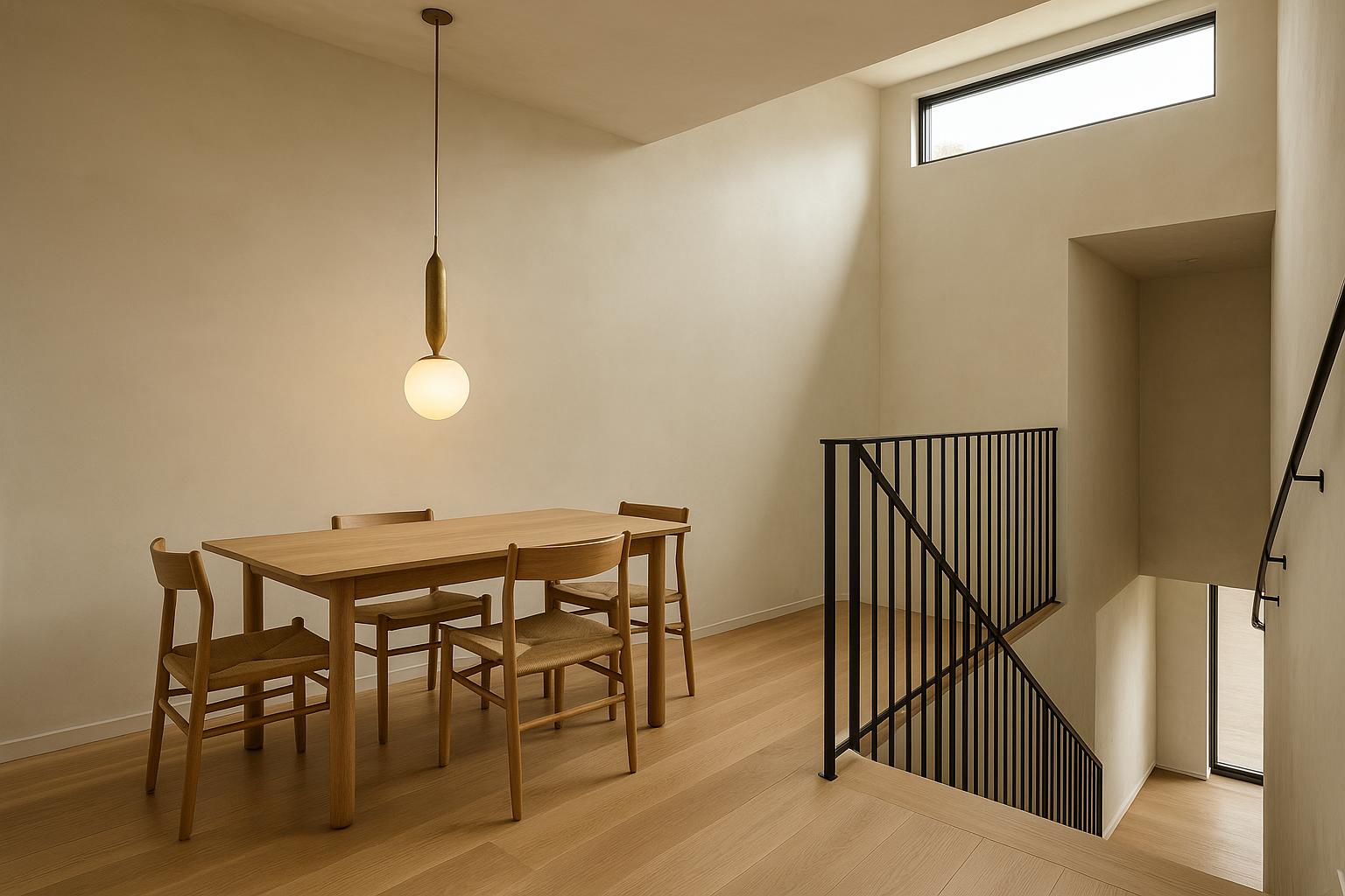
The object and its illumination need separate consideration. Establish where the light leaves the fitting and what stands in its path. An opaque shade may send a concentrated pool downwards. Opal glass can spread brightness more broadly, while a clear globe leaves the lamp visible and makes its appearance part of the design.

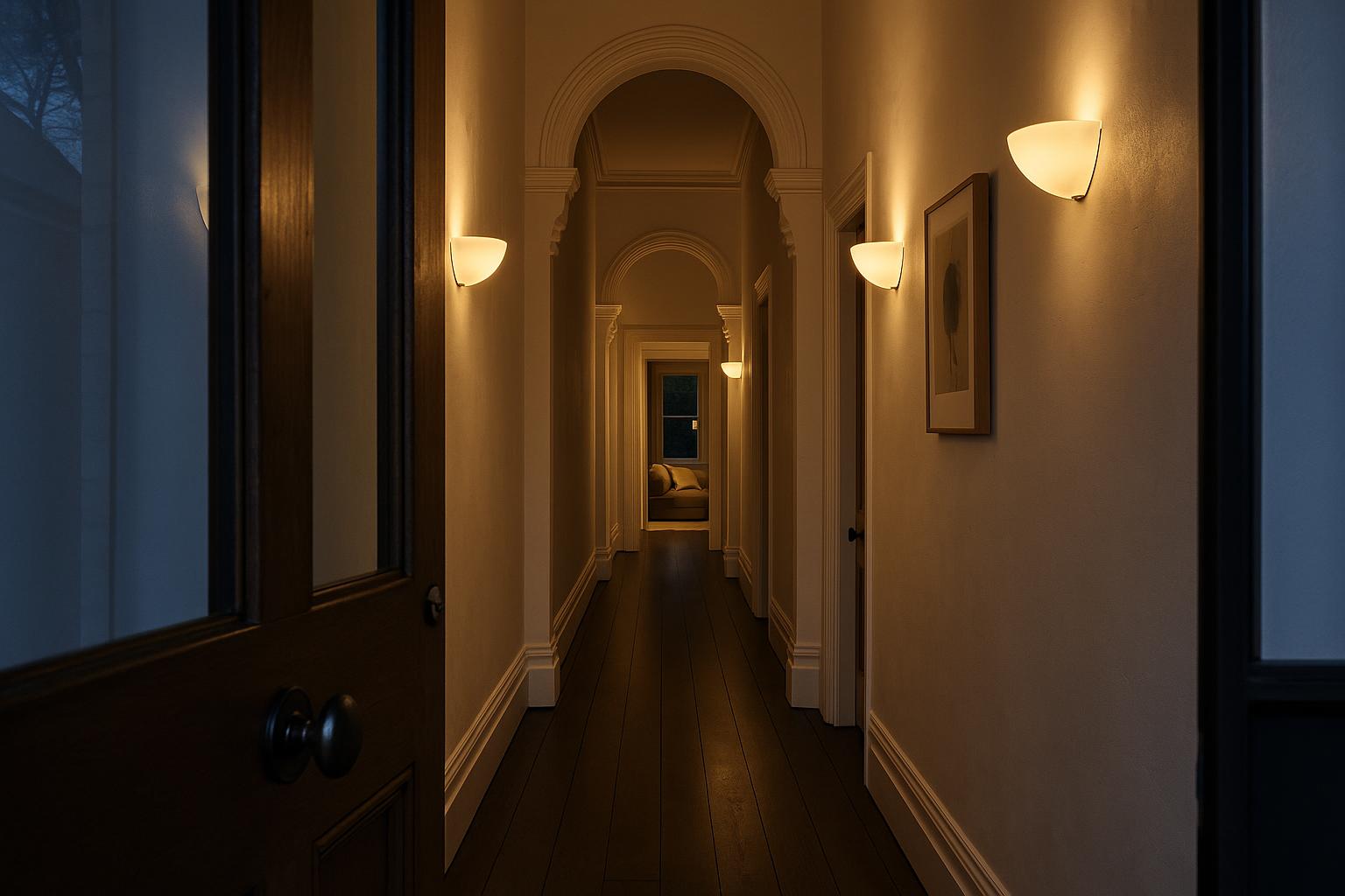
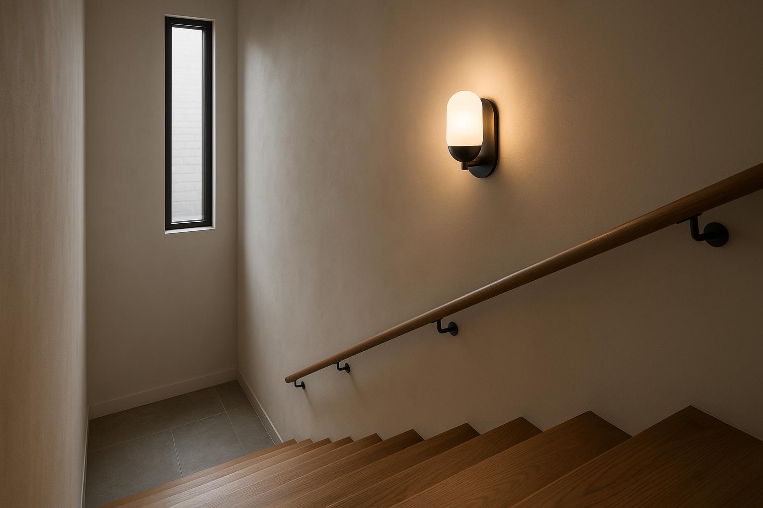
Viewing height changes the result. A bare lamp above an island may be unobtrusive when standing yet glaring when someone sits on a stool. A wall light with a bright opening at the top can be comfortable in a hallway but distracting beside a staircase where it is seen from above. Product photographs should therefore be read from the likely angles in the room, not only from the most flattering angle.
Check compatible lamps, dimming information and stated light output where those details are available. For integrated LED fittings, look for clear information about the driver, access to components and the available replacement pathway. A refined housing does not compensate for illumination that is unsuitable for the task.
Inspect the details involved in daily use
Quality is often felt through ordinary actions. An adjustable reading light should move through a useful range and remain where it is directed. A floor lamp needs a base suited to its height and to the likelihood of being moved. On a bedside lamp, the switch position matters as much as the shade material.
Cleaning is another practical test. Deeply ribbed glass, layered shades and intricate metalwork can be worthwhile, but only if access is realistic for the intended location. A complex pendant in a double-height entry presents a different maintenance commitment from the same design above a standard dining table.
In the same direction, Lighting That Keeps Up with a Changing Room offers useful ideas for choosing home lighting more confidently.
Consider cords and controls as visible parts of the fitting. Cord colour, length and entry point can affect an otherwise restrained composition. If a switch, hinge or adjustment knob is likely to be touched frequently, it should be easy to reach without forcing or destabilising the light.
Decide how much attention the fitting should claim
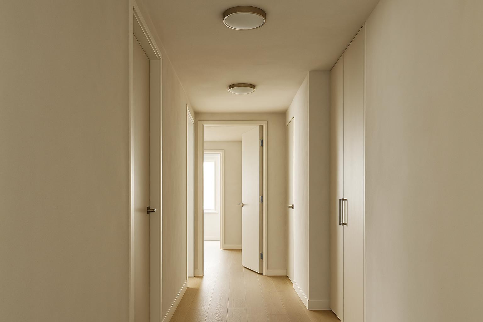
Premium home lighting does not require a feature in every room. A sculptural pendant usually appears more assured when nearby fittings are quieter. Recessed lights, simple wall fittings or low-key lamps can support the room without competing for the same view.
Before selecting a statement piece, examine what already occupies the upper part of the space. Ceiling fans, exposed beams, bulkheads, tall cabinetry and curtain tracks all add visual lines. Generous space around a decorative fitting allows its outline to register clearly; crowding can make even a well-designed piece appear misplaced.
The same restraint applies along connected sightlines. If the entry, dining area and kitchen are visible together, decide where the principal moment should occur. The other lights can still be distinctive, but they do not all need equal visual weight.
Confirm suitability for the installation site
A well-made indoor fitting is not automatically appropriate for a bathroom, covered verandah or exposed exterior wall. Use the stated product information to confirm the intended environment and discuss uncertain locations with an appropriately qualified professional. Appearance alone does not indicate resistance to moisture, weather or coastal conditions.
For more consistent lighting throughout the home, the article Old Rooms, New Light: Contemporary Fittings for Character Homes may also be helpful.
Check clearances before purchase. Cupboard doors, windows, passage routes and ceiling fans can conflict with projecting sconces or low pendants. Existing electrical points may also limit the position of a wall plate or canopy, particularly in renovations where moving wiring could affect the scope of work.
Fixed electrical installation should be handled by an appropriately licensed electrician. Supplying the product instructions in advance gives the electrician an opportunity to identify mounting, dimming or compatibility issues before installation day.
Compare options using the same brief
Premium is most useful as a standard, not a label. Write a short brief covering the fitting type, maximum dimensions, viewing angles, required lighting effect, finish preferences and site constraints. Use that same brief for every option so a dramatic photograph does not distract from a poor practical fit.

- Review the complete form, including the canopy, suspension, backplate and underside.
- Compare dimensions with furniture and architectural elements already in the room.
- Identify whether the lamp or integrated light source will be visible from normal positions.
- Check dimming, cleaning, adjustment and installation information relevant to the site.
When comparing premium lighting in Australia, shortlist fittings that satisfy the brief before choosing between finishes. This keeps the decision focused on products that can genuinely work in the room while still leaving space for personal preference.
The most rewarding fitting is not necessarily the most ornate or conspicuous. It is the one whose construction withstands close inspection, whose light is comfortable and whose everyday details continue to make sense after the initial impression has faded.